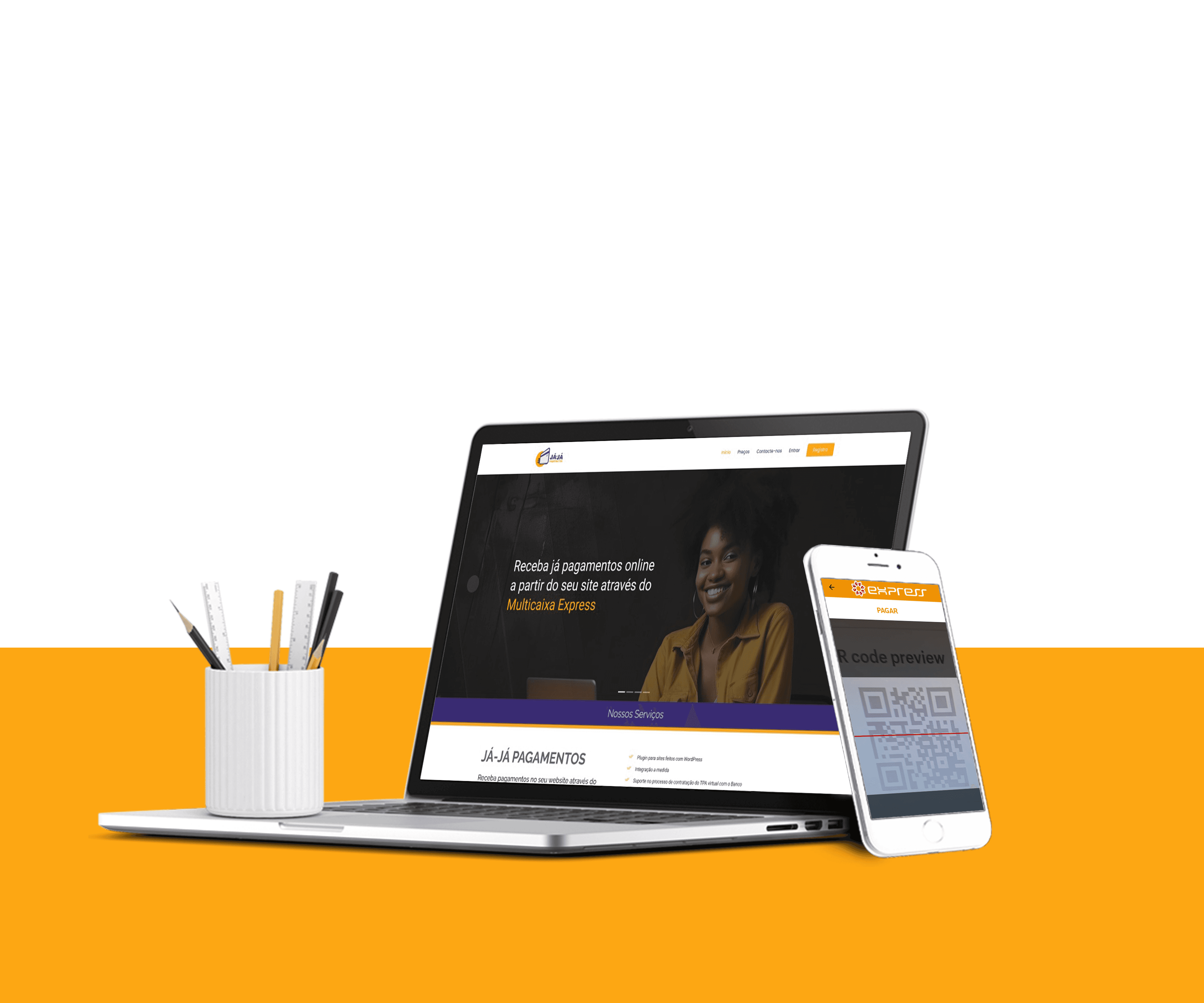
A plugin on wordpress that simplifies online payments for e-commerce and websites through three payment modalities of the Multicaixa Express digital wallet:
Reference Payments
Phone Number Payments
QR Code Payments
Client
YELLEN CORPORATE
Year
2022
Role
Product designer

The low conversion of visitors into users and the resulting lack of revenue, compromising the business's viability. Despite a significant number of website visits (over 2,000 in the first quarter), only 20 users completed the registration process, and only 2 became paying customers.
These numbers indicated barriers in the registration flow, leading to drop-offs and hindering the platform’s monetization.
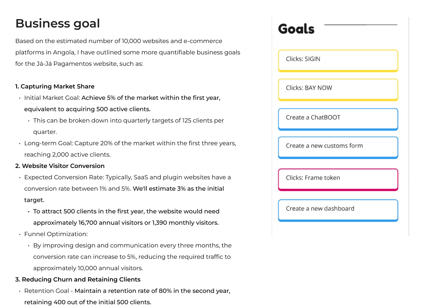
What are the main friction points in the registration flow?
At which stage of the process do users drop off the most?
Is there any confusing or unnecessary information in the registration form?
Process
Tools
Wireframe
Prototype wireframe
Test and Delivery
Team
Product Designer | PO | Technical leader | Software engineers
After analyzing the data from the launched MVP, I identified some significant gaps on the website. In the first quarter, the site had over 2,000 visits, resulting in only 20 account creations. Of these, only 2 converted into paying customers.
To better understand these numbers and their causes, I proposed conducting a usability test with 5 users, complemented by analytical tools such as Hotjar. I utilized heatmaps, conducted an A/B test, and reviewed 50 screen recordings to identify friction points in the user experience.
Based on the insights gathered, I developed a new information hierarchy to prioritize the most relevant content on the page and restructured the user flow. Collaborating with the marketing team, we devised a strategy to attract more qualified leads, including implementing direct links to specific sections of the site that provided higher value to the target audience.
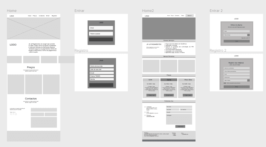
To apply the decisions made with the marketing team and validate the collected insights, I developed a wireframe prototype in Figma with the new hierarchy, highlighting the barriers previously identified in the initial research. During this process, I conducted 15 usability tests and achieved a 77% successful registration rate. By measuring the results, I identified critical issues affecting conversions and hindering the product's success, with the main barrier being the use of the FRAME TOKEN in the registration form.
Based on these insights, I moved on to the visual design phase and conducted another usability test with 10 new users, along with 5 participants from the previous tests who had recorded success rates below 70%. The goal was to ensure that colors, typography, and graphics did not negatively impact the positive results achieved with the wireframe but instead contributed to better performance. As a result, I achieved a 97% successful registration rate in these tests.
Deliveries were organized into short sprints, prioritizing rapid iterations and continuous feedback. I shared the wireframes and interactive prototypes with the engineering and marketing teams via Figma, ensuring alignment and facilitating implementation. Additionally, I documented decisions and adjustments in Notion to maintain process traceability.
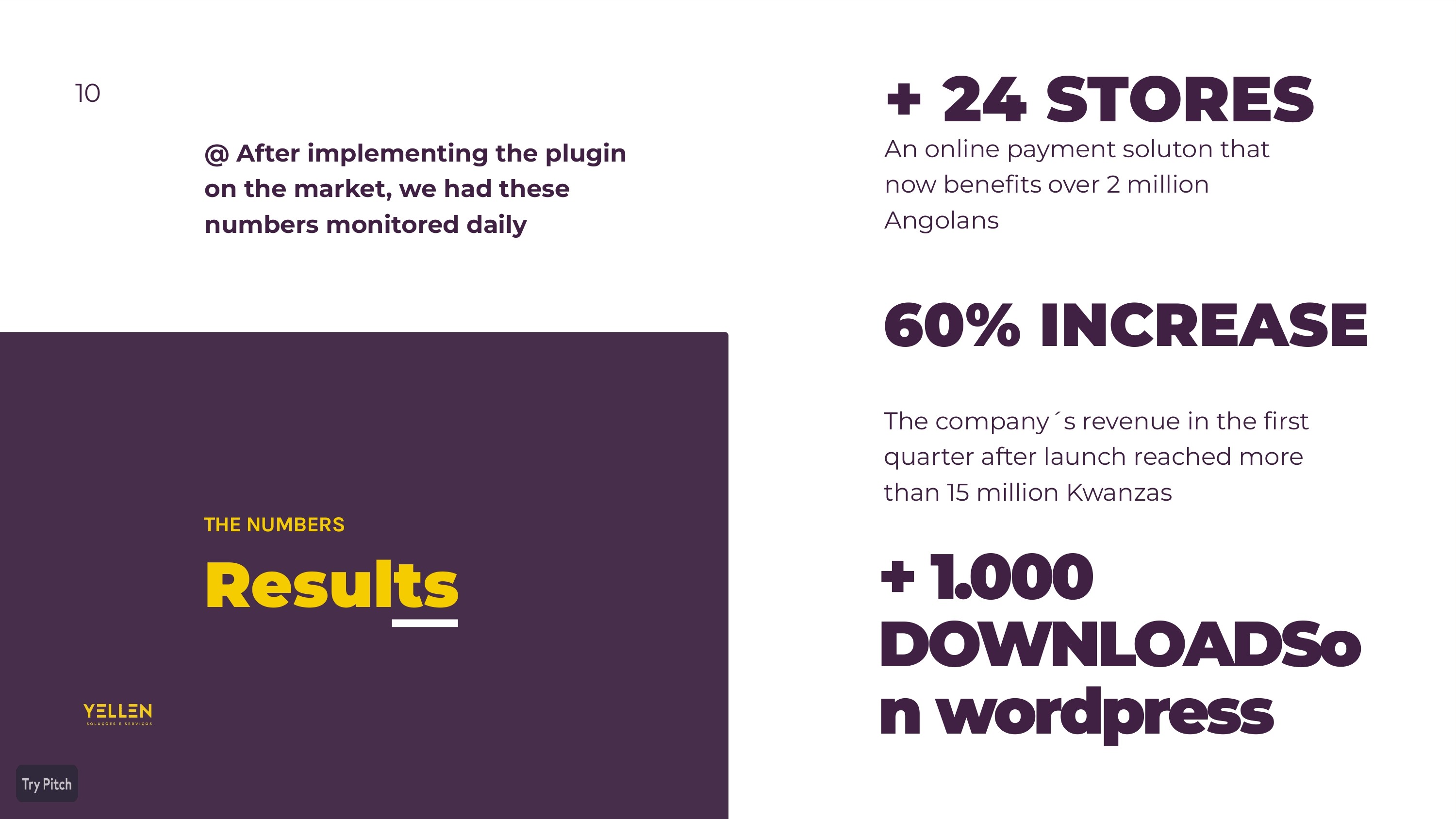
This improvement resulted in acquiring 30 paying customers in the first month, surpassing the numbers from the initial MVP 1.0 launch.

During the first semester, I was responsible for ensuring that the business goals defined in the discovery and strategy phase were met. Working in collaboration with the engineering and marketing teams, we set a goal of reaching 500 paying users in the first year. To achieve this, we delivered a series of improvements to the conversion funnel, including page optimization, interface adjustments, and the implementation of a chatbot on the website to enhance lead capture and qualification.
Through a data-driven iterative process—including heatmap analysis, A/B testing, NPS surveys, and qualitative feedback—we continuously refined the experience, increasing the conversion rate from 3% to 5% and reducing the required traffic. The introduction of the chatbot was a key differentiator, boosting visitor engagement and accelerating decision-making, which directly impacted customer acquisition and reduced doubts before conversion. As a result, we exceeded the initial target by 37.8% within the first six months.
Additionally, we focused on retention, ensuring an 80% retention rate in the second year, which directly contributed to the product’s sustainable growth. These efforts solidified market adoption, generating over 180 million Kwanzas in revenue in the first year.